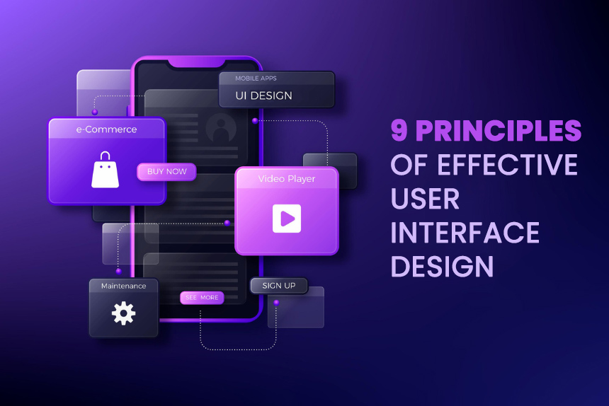
9 Principles of Effective User Interface Design to Make Your Product Shine
In today’s digital world, the user interface (UI) design of a product can make or break its success.
With so many apps and websites competing for users’ attention, having an intuitive, user-friendly UI is crucial for driving engagement and adoption of your product.
Mastering key principles of effective UI design should be a priority for any product development team.
The UI essentially serves as the bridge between the user and the product. It encompasses the visual elements, interactions, and flows that users experience when interacting with a digital product.
How to Craft Intuitive, User-Friendly Interfaces that Improve User Experience
A thoughtfully crafted user interface eliminates friction and confusion, enabling users to complete tasks and satisfy needs quickly and easily. The more intuitive and seamless the UI, the happier users will be.
On the other hand, a confusing, overly complex user interface results in frustrated users who struggle to navigate the product and may ultimately abandon it altogether.
This is why adhering to established best practices and guidelines around user interface design is so important. Companies that neglect the user experience often suffer the consequences of losing customers to more user-centric competitors.
In this blog post, we will dive into 10 key principles of effective user interface design that every product development team should know.
Following these principles will help you create polished, user-friendly interfaces that drive product adoption and user retention.
How to Keep User Interfaces Clean and Simple to Avoid Complexity

Keeping interfaces clean and minimalistic is vital for creating positive user experiences. Cluttered and complex interfaces overwhelm and confuse users, making it difficult for them to find what they need.
Some tips for focusing on simplicity:
- Only showcase necessary elements – Avoid including extraneous buttons, links, menus that aren’t absolutely required. Remove any clutter.
- Use plenty of white space – Generous spacing between elements creates visual clarity.
- Limit colour palette – Stick to one or two primary colours and use cohesive shades. Too many colours compete for attention.
- Utilise clean fonts and typography – Use simple, easy to read fonts. Avoid fancy decorative typefaces.
- Group related elements – Logically organise menus, buttons, and icons into clear categories.
- Show one path to a task – Don’t offer too many competing ways to navigate. Guide users.
- Use common user interface patterns – Leverage accepted conventions and schemas users already know.
- Write clear concise copy – Ensure interface text is straightforward. Avoid jargon.
Keeping these tips in mind will help you stay focused on simplicity. The result is an intuitive interface users can navigate effortlessly.
Create Consistent User Interfaces with Unified Design Elements

When interfaces utilise consistent elements and patterns, it builds user familiarity and trust.
Inconsistency is confusing and forces users to learn and relearn how the interface works.
Some ways to maintain consistency:
- Use consistent user interface patterns – Things like navigation menus, search bars, and buttons should function the same throughout.
- Standardise visual treatments – Apply the same styles to all headings, body text, links, icons etc.
- Stick to layout principles – Ensure page and content layouts align across the product.
- Follow platform conventions – Respect OS or browser interface standards users expect.
- Use common terminology – Label buttons, menus and icons consistently.
- Standardise interactions – Make clickability, hovers, selections work consistently.
- Maintain state icons – Visual indicators like notifications or status icons should look and act the same.
- Preserve naming schemes – Use the same terminology, structure and patterns when naming.
Consistency helps users intuitively understand how to use your UI based on learned behaviour.
Even slight inconsistencies are jarring. So maintaining consistency should be diligently enforced by UI/UX designers. The result is smooth, frictionless experiences for users.
Guide Users with Intuitive Navigation to Help Them Find What They Need
Users need to be able to easily move through an interface to access different features and content. Clear, intuitive navigation is essential for usability.
Some tips for providing effective navigation:
- Use common navigation patterns – Elements like breadcrumb trails, dropdown menus, and persistent left/top nav bars leverage existing user familiarity.
- Structure navigation systematically – Group related content together under parent categories and provide clear navigation hierarchy.
- Use clear, descriptive labels – Avoid ambiguous icons or links. Use text that clearly explains the destination.
- Show current location indicators – Elements like bolding or colouring the current page help orient users.
- Prioritise primary navigation – Ensure most important links are highly visible and prioritised. Secondary navigation can go in expandable sections.
- Use website convention on mobile – Maintain a persistent bottom nav menu mobile to allow easy movement between sections with a tap.
- Eliminate dead ends – Ensure users can easily navigate backwards if they go down a path. Breadcrumbs help.
- Test information architecture – Observe users navigating and refine architecture based on pain points.
Providing users clear wayfinding improves confidence in navigating your interface. Minimise user confusion by ensuring navigation options are laid out intuitively.
Follow User Interface Guidelines of Each Platform for Familiarity
Users have certain expectations when it comes to how interfaces should function based on the platform.
Following established UI/UX conventions for each platform ensures a familiar, intuitive experience for users.
Some tips for respecting platforms:
- On iOS, follow Apple’s Human Interface Guidelines – This covers recommended navigation patterns, gestures, interface elements, etc. Familiarity helps iOS users.
- On Android, adhere to Material Design principles – Material Design is Google’s mobile UI framework. Leveraging its components breeds familiarity.
- On the web, respect browser patterns – Use expected page layouts and standard browser UI elements like scrollbars.
- Across platforms use common UI elements appropriately – For example, hamburger menus for mobile navigation vs heavyweight nav bars for desktop sites.
- Display controls correctly on each platform – Follow guidelines for app bars, buttons, inputs, cards and more.
- Use platform-standard navigation – Like bottom tab bars on iOS and bottom nav menus for Android apps.
- Incorporate platform animations – The transitions and microinteractions should align with platform standards.
- Implement platform gesture conventions – Like swiping patterns and directional dragging/scrolling.
Respecting the deep user familiarity with each platform creates instinctive interactions. Users should not have to learn new models to use your product.
Provide Users with Feedback to Confirm Actions and Communicate System Status

Providing users with timely and informative feedback on their interactions is vital for usability.
Without proper feedback, users will feel lost and confused when using a product.
Some best practices for feedback:
- Indicate status changes clearly – If a setting is saved or an item is added to a cart, confirm it visually.
- Show system status – Use loading indicators and progress bars to show background processes.
- Confirm actions before completion – For serious actions like delete, have users confirm first.
- Notify errors immediately – If a form isn’t submitted, let users know why right away.
- Use indicators consistently – Standardize highlights, notifications, validation messages.
- Provide assistance as needed – Offer help text for complex sections and hint text for inputs.
- Allow reversal of actions – Include easy undo options in case users change their mind.
- Set proper expectations – Communicate upfront how long tasks may take to manage expectations.
- Follow platform conventions – Use native alerts, action sheets, and pickers when appropriate.
The right feedback mechanisms improve perceived usability and user confidence. Feedback should be provided in a non-intrusive yet highly visible manner at the right time.
Minimize User Errors by Proactively Designing Interfaces to Prevent Mistakes
A key part of creating usable interfaces involves proactively designing the user interface to minimise the possibility of users making errors. It’s better to prevent errors upfront than try to handle errors after they occur.
Some best practices for preventing errors during the design process include:
- Simplifying complex tasks into clear step-by-step processes so users are less likely to get lost or confused. Breaking down a complicated workflow into separate simple, linear steps prevents mistakes.
- Setting proper expectations by communicating upfront what inputs are valid, what formats work, and what selections users have to make. This guidance helps users provide the right inputs.
- Applying input constraints and validation to ensure the proper data format is followed. Things like character limits, numeric/text input types, input masks, and field validation rules prevent incorrect entries.
- Providing smart default values or preselections so users don’t start with a blank slate. Setting expected defaults reduces effort and potential errors.
- Limiting choices and avoiding overload by simplifying options into just the essential set. Too many options can lead to mistaken selections.
- Requiring confirmation before destructive actions like deleting data or account cancellation to prevent unintentional loss.
- Allowing easy undo of actions, so users can reverse steps if they realise they’ve made an error.
Personalise when possible – Allow for customization and personalization when appropriate.

Ensuring accessibility should be a core focus for any user interface designer. People with disabilities should be able to effectively use digital products through inclusive interface design.
Some tips for accessible user interface design include:
- Add appropriate ARIA roles to interface elements to make them usable with assistive technologies like screen readers.
- Write descriptive alternative text for all visuals so screen reader users can understand images and icons.
- Design buttons large enough and with ample spacing for motor impaired users who navigate by switch devices.
- Make sure colour contrasts meet minimum ratios to accommodate visually impaired users.
- Allow keyboard navigation as a robust alternative to mouse interactions.
- Use semantic HTML elements like main, nav, header for better screen reader context.
- Provide captions and transcripts for audio and video elements.
- Avoid reliance on colour alone to convey meaning which impacts colour blind users.
- Animate transitions and scrolling at sensible speeds that don’t cause issues for vestibular disorder.
- Support screen magnifiers to aid visually impaired users.
Building accessibility in from the start ensures people with disabilities can effectively use your product rather than excluding them altogether.
Prioritise usability – Focus on ease of use and user goals over aesthetic appeal.

When it comes to user interface design, usability should always be the top priority rather than just making interfaces look aesthetically pleasing. Form should follow function.
Some tips for prioritising usability:
- Understand target users and their goals – Design the flows and user interface to directly help users complete key tasks.
- Focus on simplicity – Avoid unnecessary complexity purely for visual appeal. Stick to essential elements.
- Use familiar user interface patterns – Leverage UI conventions users already understand rather than reinventing the wheel.
- Organise intuitively – Arrange interface elements in a logical way that matches user expectations.
- Minimise required steps – Streamline processes to require the fewest number of steps and inputs possible.
- Reduce cognitive load – Craft flows and layouts that are obvious and easy to scan rather than overly clever.
- Make actions and options visible – Promote discovery by making key actions clearly visible at all times.
- Test with users – Observe real people using the user interface and refine based on usability issues observed.
- Readability matters – Ensure text is readable by using appropriate fonts, sizes, contrast.
- Function over form – If a custom control improves aesthetics at the cost of usability, don’t use it.
Never sacrifice usability purely for aesthetics. While visuals are important, usability always comes first.
Test and refine – Continuously test the user interface with users and refine it based on feedback.

Testing interfaces with real users is critical for ensuring excellent usability. No amount of designer intuition replaces direct user feedback.
Some tips for effective UI testing and refinement:
- Conduct usability testing early and often. Testing early prototypes prevents problems from snowballing.
- Select participants who represent your target demographic to get feedback from real users.
- Define clear tasks for testers to complete during the sessions based on key user goals.
- Observe where testers struggle and measure success rates for task completion. Identify pain points.
- Ask testers to think aloud during the session to vocalise their thought process and confusions.
- Record sessions to review again later from an analytical perspective.
- Analyse results to uncover issues with findability, understandability, ease of use.
- Make refinements and then re-test with new users to validate improvements.
- Test across different devices and browsers to ensure consistency.
- Conduct accessibility testing with disabled users to identify required improvements.
- Test with participants who are new to the product to observe first impressions.
- Use a usability testing service if you can’t recruit participants yourself.
Continuous testing and refinement is crucial to achieving polished, highly usable interfaces optimised for target users. Testing early and often pays off tremendously.
Conclusion
For companies lacking in-house design expertise, partnering with a UI/UX design firm can be invaluable for ensuring interfaces follow established best practices and design principles.
Firms like Infin Mobile Solutions have teams of experienced designers focused on crafting intuitive, user-centred interfaces.
Some key benefits of leveraging an external UI/UX design partner include:
- Access to design experts who immerse themselves in the latest UI/UX trends, standards, and emerging best practices. They stay on top of evolving design expectations.
- Professionals dedicated to user research to deeply understand target users, goals, behaviours, and pain points. This insight informs the design.
- Adherence to proven design principles and patterns that foster intuitive usability rather than reinventing the wheel.
- A rigorous design process that involves rapid iteration, user testing, and refinement to polish the user interface .
- A focus on not just aesthetics but functional, goal-driven design that solves real user problems.
- Experience designing interfaces optimised for a variety of platforms and devices.
- Ability to free up internal teams to focus on other aspects of product development.
The right design partner ensures interfaces align with user expectations and embody essential principles like simplicity, consistency, and accessibility. This ultimately leads to higher product quality and user satisfaction.
Key takeaways
Well-designed user interfaces are critical for building engaging, user-friendly digital products. In this, we covered core user interface design principles that can help any product team craft intuitive interfaces that delight users.
To recap, the 10 key principles are:
- Focus on simplicity – Eliminate complexity and clutter for clean, minimalist interfaces.
- Ensure consistency – Maintain visual, interactive, and navigational consistency.
- Provide clear navigation – Create intuitive paths that guide users seamlessly.
- Follow platform conventions – Adhere to native UI/UX patterns users are accustomed to.
- Offer informative feedback – Communicate system status, errors, confirmations clearly.
- Prevent errors – Design proactively to avoid errors before they occur.
- Ensure accessibility – Accommodate users with disabilities through inclusive design.
- Personalise when possible – Enable customization to individualise the experience.
- Prioritise usability – Always focus on ease of use and goals over aesthetics alone.
- Test and refine – Continuously test with real users and iterate.
Applying these principles results in frictionless, understandable interfaces that both meet user needs and deliver joy through the experience.
UI design should be a priority, not an afterthought, for teams aspiring to build truly user-centric products that win over customers.
FAQs
Is the user interface an operating system?
No, a user interface is not an operating system. The user interface is the visual part of an operating system or application that allows a user to interact with it. The UI sits on top of the operating system.
Is the user interface a system software?
The user interface can be considered a type of system software because it serves as an interface between the user and the application or operating system. The UI enables interaction rather than performing computations.
Is user interface important?
Yes, the user interface is extremely important. A good user interface allows users to intuitively and easily interact with a system. It enhances the user experience and improves usability. A poor user interface confuses and frustrates users.
Which user interface is more user friendly?
Factors like simplicity, consistency, responsive design, meaningful graphics, and intuitive navigation determine how user friendly a UI is. Interfaces with these attributes tend to be more user friendly than complex, inconsistent ones.
Which user interface is best?
The “best” user interface depends on the context, requirements, and end-users. For consumer products, intuitive mobile or web interfaces like iOS and MacOS are often considered highly user-friendly. For enterprise applications, interfaces optimised for productivity rate highly.
Why is user interface design important?
Good user interface design is important because it directly shapes how users interact with a product. UI design focuses on anticipating user needs and making elements like navigation, controls, buttons easy to find, understand, and use. This improves the overall user experience.
Why become a user interface designer?
UI design is an exciting career path for people interested in combining design principles, technology, and user psychology. UI designers focus on user-centric designs that make digital products like apps and websites appealing and intuitive to use.
Your point of view caught my eye and was very interesting. Thanks. I have a question for you.
Thank you for your sharing. I am worried that I lack creative ideas. It is your article that makes me full of hope. Thank you. But, I have a question, can you help me?
I have read your article carefully and I agree with you very much. This has provided a great help for my thesis writing, and I will seriously improve it. However, I don’t know much about a certain place. Can you help me?
Your point of view caught my eye and was very interesting. Thanks. I have a question for you.
Your article helped me a lot, is there any more related content? Thanks!
Thanks for sharing. I read many of your blog posts, cool, your blog is very good.
Can you be more specific about the content of your article? After reading it, I still have some doubts. Hope you can help me.
Your article helped me a lot, is there any more related content? Thanks! https://accounts.binance.com/uk-UA/register?ref=W0BCQMF1
I don’t think the title of your article matches the content lol. Just kidding, mainly because I had some doubts after reading the article.
Thank you for your sharing. I am worried that I lack creative ideas. It is your article that makes me full of hope. Thank you. But, I have a question, can you help me?
I don’t think the title of your article matches the content lol. Just kidding, mainly because I had some doubts after reading the article.
Your point of view caught my eye and was very interesting. Thanks. I have a question for you.
Thank you for your sharing. I am worried that I lack creative ideas. It is your article that makes me full of hope. Thank you. But, I have a question, can you help me?
Your article helped me a lot, is there any more related content? Thanks!
Your article helped me a lot, is there any more related content? Thanks!
Thank you for your sharing. I am worried that I lack creative ideas. It is your article that makes me full of hope. Thank you. But, I have a question, can you help me?
Your article helped me a lot, is there any more related content? Thanks!
Thanks for sharing. I read many of your blog posts, cool, your blog is very good.
Your point of view caught my eye and was very interesting. Thanks. I have a question for you.
I don’t think the title of your article matches the content lol. Just kidding, mainly because I had some doubts after reading the article.
Thanks for sharing. I read many of your blog posts, cool, your blog is very good.
Can you be more specific about the content of your article? After reading it, I still have some doubts. Hope you can help me.
Can you be more specific about the content of your article? After reading it, I still have some doubts. Hope you can help me.
I don’t think the title of your article matches the content lol. Just kidding, mainly because I had some doubts after reading the article.
Can you be more specific about the content of your article? After reading it, I still have some doubts. Hope you can help me.
I don’t think the title of your article matches the content lol. Just kidding, mainly because I had some doubts after reading the article.
Thank you for your sharing. I am worried that I lack creative ideas. It is your article that makes me full of hope. Thank you. But, I have a question, can you help me?
Thanks for sharing. I read many of your blog posts, cool, your blog is very good.
I don’t think the title of your article matches the content lol. Just kidding, mainly because I had some doubts after reading the article.
Thank you for your sharing. I am worried that I lack creative ideas. It is your article that makes me full of hope. Thank you. But, I have a question, can you help me?
Your article helped me a lot, is there any more related content? Thanks!
Your point of view caught my eye and was very interesting. Thanks. I have a question for you.
Thanks for sharing. I read many of your blog posts, cool, your blog is very good.
Can you be more specific about the content of your article? After reading it, I still have some doubts. Hope you can help me.
Thank you for your sharing. I am worried that I lack creative ideas. It is your article that makes me full of hope. Thank you. But, I have a question, can you help me?
Your article helped me a lot, is there any more related content? Thanks!
Thank you for your sharing. I am worried that I lack creative ideas. It is your article that makes me full of hope. Thank you. But, I have a question, can you help me?
Thank you for your sharing. I am worried that I lack creative ideas. It is your article that makes me full of hope. Thank you. But, I have a question, can you help me?
Your point of view caught my eye and was very interesting. Thanks. I have a question for you.
Thanks for sharing. I read many of your blog posts, cool, your blog is very good.
Can you be more specific about the content of your article? After reading it, I still have some doubts. Hope you can help me.
Your article helped me a lot, is there any more related content? Thanks!
https://t.me/s/Official_1win_kanal/138
Официальный Telegram канал 1win Casinо. Казинo и ставки от 1вин. Фриспины, актуальное зеркало официального сайта 1 win. Регистрируйся в ван вин, соверши вход в один вин, получай бонус используя промокод и начните играть на реальные деньги.
https://t.me/s/Official_1win_kanal/2011
Официальный Telegram канал 1win Casinо. Казинo и ставки от 1вин. Фриспины, актуальное зеркало официального сайта 1 win. Регистрируйся в ван вин, соверши вход в один вин, получай бонус используя промокод и начните играть на реальные деньги.
https://t.me/s/Official_1win_kanal/2341
https://t.me/s/Official_1win_kanal?before=6238
https://t.me/s/Official_1win_kanal?before=3772
Your point of view caught my eye and was very interesting. Thanks. I have a question for you.
Your point of view caught my eye and was very interesting. Thanks. I have a question for you.
Results-oriented professionals, results exceed expectations consistently. Achievement-oriented service. Achievement appreciation.
I don’t think the title of your article matches the content lol. Just kidding, mainly because I had some doubts after reading the article. https://www.binance.com/fr-AF/register?ref=JHQQKNKN
Can you be more specific about the content of your article? After reading it, I still have some doubts. Hope you can help me. https://www.binance.info/register?ref=P9L9FQKY
Thank you for your sharing. I am worried that I lack creative ideas. It is your article that makes me full of hope. Thank you. But, I have a question, can you help me? https://www.binance.com/join?ref=IJFGOAID
Dry Cleaning in New York city by Sparkly Maid NYC
Thanks for sharing. I read many of your blog posts, cool, your blog is very good. https://www.binance.info/es-MX/register-person?ref=JHQQKNKN
Reading your article helped me a lot and I agree with you. But I still have some doubts, can you clarify for me? I’ll keep an eye out for your answers.
Can you be more specific about the content of your article? After reading it, I still have some doubts. Hope you can help me. binance
Your article helped me a lot, is there any more related content? Thanks!
Reading this is like watching the tide shift subtly — gradual, persistent, and calming, revealing nuance that is always present but never forceful.
Thanks for sharing. I read many of your blog posts, cool, your blog is very good.
Thank you for your sharing. I am worried that I lack creative ideas. It is your article that makes me full of hope. Thank you. But, I have a question, can you help me?
Thanks for sharing. I read many of your blog posts, cool, your blog is very good.
Your article helped me a lot, is there any more related content? Thanks!
Your article helped me a lot, is there any more related content? Thanks!
Reading your article helped me a lot and I agree with you. But I still have some doubts, can you clarify for me? I’ll keep an eye out for your answers.
Thank you for your sharing. I am worried that I lack creative ideas. It is your article that makes me full of hope. Thank you. But, I have a question, can you help me?
Thank you for your sharing. I am worried that I lack creative ideas. It is your article that makes me full of hope. Thank you. But, I have a question, can you help me?
Your article helped me a lot, is there any more related content? Thanks! https://accounts.binance.info/ru/register?ref=O9XES6KU
Your article helped me a lot, is there any more related content? Thanks!
**vivalis**
vivalis is a premium natural formula created to help men feel stronger, more energetic, and more confident every day.
**vertiaid**
vertiaid is a high-quality, natural formula created to support stable balance, enhance mental sharpness, and alleviate feelings of dizziness
**sugarmute**
sugarmute is a science-guided nutritional supplement created to help maintain balanced blood sugar while supporting steady energy and mental clarity
**prostadine**
prostadine concerns can disrupt everyday rhythm with steady discomfort, fueling frustration and a constant hunt for dependable relief.
Your article helped me a lot, is there any more related content? Thanks! https://accounts.binance.info/kz/register-person?ref=K8NFKJBQ
Thank you for your sharing. I am worried that I lack creative ideas. It is your article that makes me full of hope. Thank you. But, I have a question, can you help me? https://accounts.binance.com/tr/register?ref=MST5ZREF
Your article helped me a lot, is there any more related content? Thanks! https://accounts.binance.info/sv/register-person?ref=GQ1JXNRE
Reading your article helped me a lot and I agree with you. But I still have some doubts, can you clarify for me? I’ll keep an eye out for your answers.
Thanks for sharing. I read many of your blog posts, cool, your blog is very good.
Can you be more specific about the content of your article? After reading it, I still have some doubts. Hope you can help me.
Your point of view caught my eye and was very interesting. Thanks. I have a question for you.
I don’t think the title of your article matches the content lol. Just kidding, mainly because I had some doubts after reading the article. https://accounts.binance.com/register-person?ref=IHJUI7TF
Thank you for your sharing. I am worried that I lack creative ideas. It is your article that makes me full of hope. Thank you. But, I have a question, can you help me? https://accounts.binance.info/en-ZA/register?ref=B4EPR6J0
I don’t think the title of your article matches the content lol. Just kidding, mainly because I had some doubts after reading the article.
Thank you for your sharing. I am worried that I lack creative ideas. It is your article that makes me full of hope. Thank you. But, I have a question, can you help me?
Thanks for sharing. I read many of your blog posts, cool, your blog is very good. https://accounts.binance.info/en-ZA/register-person?ref=B4EPR6J0
Can you be more specific about the content of your article? After reading it, I still have some doubts. Hope you can help me.
Thank you for your sharing. I am worried that I lack creative ideas. It is your article that makes me full of hope. Thank you. But, I have a question, can you help me?
Your article helped me a lot, is there any more related content? Thanks! https://www.binance.com/register?ref=IHJUI7TF
I don’t think the title of your article matches the content lol. Just kidding, mainly because I had some doubts after reading the article. https://accounts.binance.com/register/person?ref=W49FLGDN
Thank you for your sharing. I am worried that I lack creative ideas. It is your article that makes me full of hope. Thank you. But, I have a question, can you help me? https://www.binance.com/register?ref=IXBIAFVY
Thanks for sharing. I read many of your blog posts, cool, your blog is very good.
Can you be more specific about the content of your article? After reading it, I still have some doubts. Hope you can help me.
Thanks for sharing. I read many of your blog posts, cool, your blog is very good. https://www.binance.info/register?ref=IXBIAFVY
Thanks for sharing. I read many of your blog posts, cool, your blog is very good.
Your article helped me a lot, is there any more related content? Thanks!
Your article helped me a lot, is there any more related content? Thanks!
Thank you for your sharing. I am worried that I lack creative ideas. It is your article that makes me full of hope. Thank you. But, I have a question, can you help me? https://accounts.binance.com/register/person?ref=JW3W4Y3A
Can you be more specific about the content of your article? After reading it, I still have some doubts. Hope you can help me. https://www.gate.com/share/XwNAUwgM